Illustration: Solomon's Key
Product: Fanart - Devil May Cry 2
Media: Photoshop CS2 & Painter X
Close ups:

Personal project piece of fanart from the Videogame Devil May Cry 2. Practise in lighting and skin painting. original piece was inspired by the Japanese artist Icula of Uranic High, a personal favorite artist of mine who uses a mix of Fresco and Digital work; a very dark macbre style she puts towards the videogame series in her artwork which suits really well in my opinion.
"To think that he could fall for such an obvisous trap was an understatement.
The Key of Solomon was something he learnt when he first started his demonic business; it was like flypaper:
“You get a demon in - they’re trapped. Powerless. It’s like a Satanic roach motel."
He could turn a trunk into a safe, a box into a coffin and a fridge into a prison with a few simple scribbles. Easy.
This time was different.
Sure, maybe he'd seen ones in blood, humans do that all the time; but blood of his own? Kin? No.
If it was to snag, he would trash and break the seal in no time, but....this time he allowed the punishment of stabbing, beating, burning, slashing and abuse. As his back colided with the seal and burned so strong the leather bubbled against his blistering skin he could feel his blood being gripped by the hundred year olds words and ripped out of his skin.
The glass shards flickered across his eyes briefy when his knees gave in and fell. More glass thrusted into him and against the wall, the sounds he thought were lost became familar and with dry lips he managed to crack a smile.
Their relationship was never pleasant, he wouldn't want it any other way.
Pain was his affection.
And it had been too long."
Whole image was based on Solomon's Key; a demonic stype spell of keeping hold of demons until seen fit. Since the main character,, Dante Sparda is a half-devil himself, I found it ironic that he got caught in one of these traps.
posted by Petitecreme
12:00

C&G: Life Drawing Final
Product: City and Guilds final Life Drawing exam piece
Media:
Digital: Photoshop CS2/3 & PainterX
Traditional: MDF, Acrylic, marker pens, print making dye.


The background board before the prints (mounted on foamboard). The main point of this final piece was to base the work off an artist of any given choice. I went after the talented illustrator Francisco Perez. Whose street-art style made me do the traditional background (plus homage to him with the Pac-man ghost) and his digital colouring style for the actual portraits. I'm happy how it came out and I ended up with a distinction, along with the rest of my final project.Labels: illustration
posted by Petitecreme
11:30
Animation & Installation; FMP
posted by Petitecreme
14:08
Graphic Design; FMP Advertisement
Products: Graphic design work for advertising
Media: Photoshop CS2


Posters to advertise and promote the fictional Cafe's (if they were to exist). Done in a modern style to Alphonse Mucha they were inspired after a trip to the Muesee de O'say where a Art Nouveau print exhibit was on display and seeing a few of Mucha's and also Orazi's "Blue Lady" really inspired me to do this style. Alot of research went into designing in terms of composition and also the presentation of the flowers used (for season and mood). They were printed at A1.
Also, Business cards were printed out. Many Cafe's there had their own business cards and through my research, business cards are now back in fashion with stylish styles and presentation. I even went to the limit of hunting out exact locations where the Cafe's would be situated.
Labels: advertisment, graphic design, illustration
posted by Petitecreme
13:52
Illustration & Graphic Design; FMP graphic novels
Products: Graphic novels for FMP
Media: Photoshop CS2&CS3 Ex, Painter X

 Typograpghy done by me and glass/cup were practise life drawings to fill up the deadspace. The comics are bi-lingual, in English and also in French with the help of Pauline 'pip' who provided perfect French translation for both comics.
 Both comics were created with rule of colour theory of contrasting colours represent moods and atmosphere. Cafe du Soliel, the Sun Cafe, is full of bright yellows, oranges and brows, to give the appearance of hot days and warm temperatures, not to mention positive attitudes.
 While Cafe de Lune, the Moon Cafe, is the opposite; cool, contrasting colours of blues, greys and purples. This puts across the mood of soloum, negativity, and with the added rain, very miserable atmosphere that makes you wish you weren't there.
Labels: graphic design, illustration
posted by Petitecreme
13:36
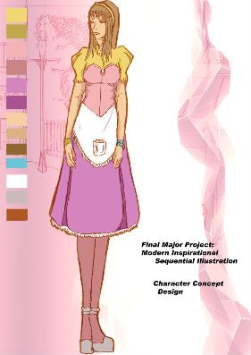
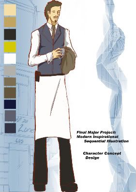
Concept: FMP Characters & Backgrounds
Media: PhotoshopCS2
Products: Character and background concept for Final Major Project.
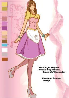
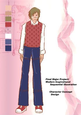
The 'Cafe du Soliel' cast; brightly coloured and elaborated outfits to portray the 'sunnier' side of serving, "Service with a sunny smile" After all. These were the concepts and guides in helping to produce the comics.
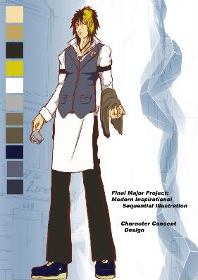
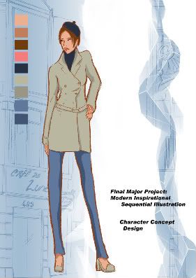
The 'Cafe de Lune' Cast had a much duller tonal range, with the exception of the lead character's streak of blonde hair (cresent moon). "Comfort in coldness" was the motto as I had plans to produce the cafe location alongside a back alley in the centre of Paris, where is is indeed, after my trip there, to be dank and quite grim.
 The location of Cafe du Soliel is from my experiance around the North of Paris in Sacre-Couer. Where everything was on a slant and every building looked different from the other. Plus the weather was lovely up there and you could see everything from that height.
 Cafe de Lune's location was changed from inside a small alley to outside along a road. Being in the centre of Paris, there was thousands of cafes, that all looked the same on the exterior; which was rather depressing. I kept this in my theme with dull colours and the only thing to stand out would be the signs, to suggest something more different inside.

The interiors was used as a guide to help me mark out what would be included in the comic. Sun Cafe was based heavily on a resturant I visited one evening which was incredibly spacious and so friendly. There were around 10-15 drawings of the layout plan and how it would look in draft form in the concept sketchbook.

Cafe's in the centre of Paris are very cramp; lots of tables and chairs pilled in with very little room to move about. I should know, I was stuck between two tables with four freinds, and the trouble we had to get out was impossible. The Lune Cafe's interior was to differ from this to be big inside and also a second floor were in plans to be a place to study, like a coffee lounge, with a huge cresent moon table. This sadly never came into the story and was left.
Labels: concept, illustration
posted by Petitecreme
13:06
Concept: Deep sea fish
Media: Photoshop CS2, Painter XProduct: Concept, lighting practise.
 "The Skullfish is a hybdrid breed of the deepsea underwater dark Angler Fish. Using a self generated light that attracts smaller fish he gobbles them up with his over powered large extended jaw.
The term of naming him 'skull' comes from the strange jaw-set it has that resembles a humans muscle jaw structure, which allows it to extend more than normal to devour much larger prey."Being a huge fan of the Angler fish; I adpated one with a more human-like skull to it - to make it seem more sinister. This comes with having join muscles of that from a human jaw so it can indeed open and close its mouth (to an extent as all angler fish have a trouble of closing completely because of their large teeth) with a bit more ease. This was also a texture and lighting practise, using Painter to give it more of a leathery skin.Labels: concept, illustration
posted by Petitecreme
11:01
Graphic & Illustration: Exhibition posters '07 & '08
Products: Graphic Design advertising posters for New college Stamford Winter Exhibition 2007 and the End of year Foundation Arts Exhibition 2008.
Media: Lightbox, PhotoshopCS2, PainterX

 Poster was designed and constructed in under four hours due to incredibly tight deadline. Sketched quickly and done over on a lightbox then imported into Painter and Photoshop for blending and textures of that from Street/ Graffitiart that I was studying at the current time. Overall, it wasn't going to be chosen due to myself not being present on the day and everyone else voting for themselves. However the Graphic degree students were brought in and mine was voted the highest due to creativity and originality. Aditional evening invitation flyer was also produced for the opening night.
 Created for the New College Stamford End of Exhibition Foundation Art & Design section of the NCS Art show, a simple constructed poster with a hidden message only know to the Foundation students; (that there were some people who were submitting work with very little effort, hense the stickfigure drawing) An aditional flyer for the evening and also for the week were also produced. I volenteered to design and produce this; with the sucess of the previous one, there were no complaints.
Labels: advertisment, graphic design, illustration, posters
posted by Petitecreme
09:45
♚FAQ♚

This is the blog belongs to Gemma-Nicole D.S. and hosts as my online public portfolio for the time being.
Experiance:
Traditional and digital art in Illustration and Graphic Design. I've worked on several commerical projects including concept work for a GP2X game system, comic stips and advertising; for stores and exhibitions.
Use of work:
None of the work here may be used for commerical and non-commerical profit/usage. Any art wishing to be used for non-commerial use, must be in writing to gem_sama@hotmail.com.
More information to come later.
Labels: FAQ, photo
posted by Petitecreme
06:35


